Could Blackburn Rovers’ new home kit look any cheaper?
![]()
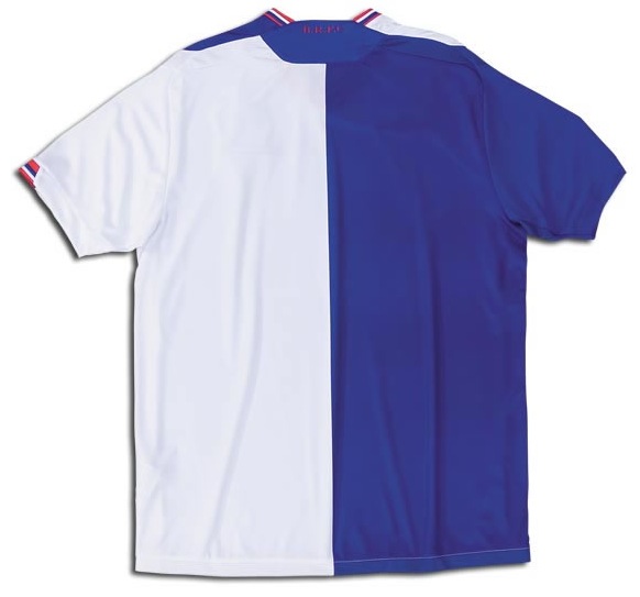
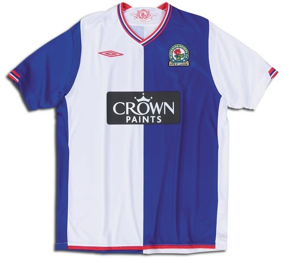
Answer: no it couldn’t. I’m all for simple kits, and though this new Umbro shirt is simple, it looks horribly cheap and flimsy. And the shirt sponsor, which sticks out like Gareth Southgate’s nose, looks like it’s been ironed on. Not good. Agree, disagree? Leave a comment or vote after the jump (and see a super-exciting rear view of the shirt)…


How does it differ from the past year’s?
Besides not having Tugay’s name and number on it?
Looks like something a fourth division side would have worn in 1992.
The shirt itself is fine its that bloody awful sponsors logo slapped on the front of it which is a shame, I don’t think i’ll be buying this one either!!
as hirsty said, the sponsors logo cheapens the whole shirt down.
It’s not the best kit and the logo is terrible, but there is MUCH worse in the league.
Whats with the 90’s collar? Naf
Thank god I bought last seasons one this is shocking
I really like it, although I agree the sponsor’s logo is horrid. Less is more… I feared much worse having seen Umbro’s new Hearts shirt which has a horrible collar, flapping around like a broken bird’s wing
when is this one on sale !!!!!!
hahahaha
that is one NASTY shirt!!!
well it aint claret and blue so thats a good thing