Shit Football Kits: Bolton’s Latest Eyesore, 2011/12
By Chris Wright
Bolton’s last few home kits haven’t exactly been easy on the eye, but their incoming 2011/12 strip is a whole ‘nother level of ugly…
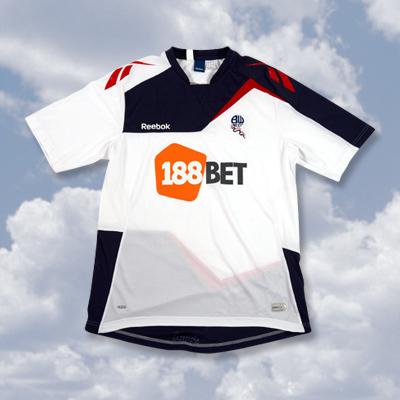
Yep, Reebok have got it all wrong…again.
Now granted, I’m definitely a ‘less is more’ kind of chap when it comes to kit design, but there’s just far too much going on for my liking – it looks like the stitched-up tatters of three separate strips.
It’s a big ‘downvote’ from Pies.
Your thoughts?


Do Arsenal Artificially Enhance The Emirates Atmosphere? – OTP
Big Cup Bullshit – The FCF
Guess UEFA Cup Finalists From Their Shirt – Three Match Ban
20 Damning Steve Kean Quotes – Mirror Football
'Abandon All Hope…' – Sunshine Room
Leaked Blackburn Letter Shows Extent Of Turmoil – EPL Talk
Genius Who Couldn't Exist Today: Dragan Stojkovic – LBITCR
German Philosopher Reflects On Jose Mourinho – Futfanatico
Rule Changes That Could Hand Title To Man Utd – FourFourTwo
Welcome To Posh – Danny Last for IBWM
Who has the final say in these horrible designs? He/she must be mentally challenged or something.
Ugly? Definitely
But polygon design does lend itself well for rendering in old footy video games like fifa98 or ISS 98
its not that bad… i mean i don’t love it, but i’ve seen a whole lot worse. i agree on the whole less is more thing though.
It is indeed ugly. Trying a little Tottenham there on the shorts maybe?
I dunno, I just know that I feel sorry for the Bolton players who have to wear it next season.
Reebok need to have a serious meeting within their design team. This should have gone in the bin marked ‘incinerate’.
Haha the players look pissed off just modelling them
DREADFUL
Last decent kit from Reebok for Bolton was 2003-2005, with 1993-95 being the best of them all. Overall, for a company which had some decent hit kits with Liverpool and even Manchester City.
the socks are nice:) overall not really deserving of a “shit kit” posting.
hahaha
really ugly!
my feeling is that less-is-more works better when you have an iconic strip (brazil, real madrid, etc.). bolton’s colors aren’t really distinctive, so it’s more effective to market your brand with something unique (even if it’s a bit shit). a good example of this is man city who, after the takeover, went back to a simpler kit in an attempt to build an iconic brand. bolton’s best hopes are that at some point they have enormous success, and that whatever kit they wear at that point, no matter how strange or different (think of ajax’s single red band), will gain an iconic, and therefore simple, status.
the real question is who approves these kits as says theyre ok to wear in front of the world…poor bolton
The shorts aren’t awful. If the shirt were in that same vein, the kit would look much better.
Shirt=Awful.
Also, what idiot at Reebok let the players wear NIKE and ADIDAS boots for the promotional pictures? I know they can’t contractually wear other football boots, but they sure as hell can have on a pair of fucking Reebok trainers. I think a German squad did that same thing recently.
Kind of see what they were going for. Still is an epic fail.
Really?
I like this kit. The polygonal design fits well.
If I were a Bolton fan I certainly wouldn’t buy one! :/
Totally agree with “it looks like the stitched-up tatters of three separate strips”…
Shame, poor souls
@Kyle
Yeah even on Chelsea’s new kit photoshoot some of the players were wearing Nike boots. You’d think such big companies would have a bit more marketing know-how, right?
[...] Shit Football Kits: Bolton's Latest Eyesore, 2011/12 » Who Ate all … [...]
Kit aside the presentation is poor. That background and default photoshop drop shadow over the whole player. It looks like an amateur put it together.
All aboard! Welcome to Bolton of the Seas. Shuffleboard on deck two, shopping on deck three and the buffets are open all day and night. Can I get those bags for ya miss in my smart cabin boy dress.
WHAT THE FUCK IS THIS?!
I think it is nice more like Japaness Cartoon Gundam! Has anyone seen before.
As a bolton fan i am happy that our shirts are not always the same with only very minor changes (Arsenal, fulham) and it will be a grower.
these modern strips are so fuggin naff, Bolton play in white shirts and black shorts, lets get some tradition back in the game