Chelsea Launch New 2011/12 Third Kit – It’s All A Bit ‘LA Galaxy’ (Photos)
By Chris Wright
Looking a bit ‘LA Galaxy’, here we have a couple of photos of Chelsea’s brand spanking new third strip for 2011/12 that, as you can clearly see from the shot below, Lamps was overjoyed at being roped in to model.
If, like us, you thought the collar was some kind of velvety denim at first glance, fear yet not – for it too is made of recycled plastic bottles and angel’s tears like the rest of the kit…
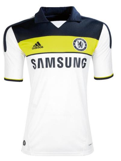
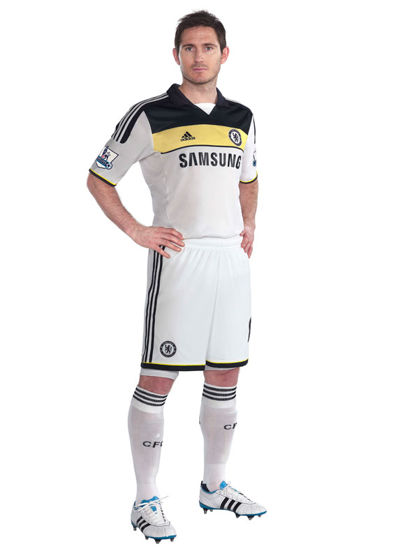
Like it, in fact we like it more than both the home and away kits Chelsea will be sporting this season – even if it does look a little untidy in and around the armpit area.
All-in-all, it’s a definite improvement from some of the gaudy neon eyesores that Adidas have foisted on them over the past couple of years.
What say you Pies fans? Thumbs up or thumbs down?


Do Arsenal Artificially Enhance The Emirates Atmosphere? – OTP
Big Cup Bullshit – The FCF
Guess UEFA Cup Finalists From Their Shirt – Three Match Ban
20 Damning Steve Kean Quotes – Mirror Football
'Abandon All Hope…' – Sunshine Room
Leaked Blackburn Letter Shows Extent Of Turmoil – EPL Talk
Genius Who Couldn't Exist Today: Dragan Stojkovic – LBITCR
German Philosopher Reflects On Jose Mourinho – Futfanatico
Rule Changes That Could Hand Title To Man Utd – FourFourTwo
Welcome To Posh – Danny Last for IBWM
Looks like lampard has just signed for spurs
im torn on this one – i like it in the first photo, but it doesn’t look as good when it is being worn. in my opinion, its the opposite of the away kit which looks better during a match than it did in the release photos
Why do they not just have a different kit for each game(disposable?)
in this way they can maximise profits and double wages without getting into major debt? In fact double the price of admission, pies….fans exist to be fleeced. Ken Bates wouldn’t say no.
You can’t tell where the shirt begins and the background ends
LA shirts are infinitely better.
To Infinity and Beyond!!!
But seriously, those = crap x fail / poo on a stick.
LAMPARD IS SUCH A FAT FUCK
Actually, that’s the flag of the Russian Empire from Romanov dynasty time. http://en.wikipedia.org/wiki/File:Romanov_Flag.svg
Good lord Al Neri, you must have been waiting a long time to use that knowledge on a football website.
can i have one of this kit…… i really love to have one
@Benji Hahahah :)
l love it,if love the Third Kit one pass the 2nd
Ok you all are not chelsea fans so I forgive you, the reason this strip has those three colors “black yellow and white” is to bring back the color of the first chelsea kit which had those 3 colors in 1905
The black should be blue than it would be truly a superb kit, otherwise its a really nice kit.