Barcelona have thrown caution to the wind and designed themselves a new club crest.
The new logo has been unveiled for public perusal, though it is still subject to member approval.
This be that…
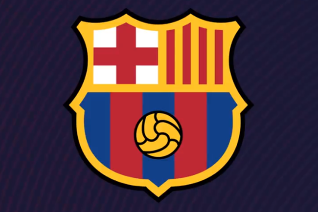
Image: FC Barcelona
The keen-eyed sleuths amongst you may noticed that the only major change is the removal of the ‘FCB’ initials from the middle of the shield, with the internal black outlines also binned to make the whole thing look uncluttered and anodyne – like an unlicensed Pro Evo badge, such is the current appetite for soulless, corporate-friendly club livery.
It’s dull, but it’s ‘streamlined’ and it’s ‘scalable’, i.e. easily legible whether blown-up or shrunk down, depending on the context of its use.
Here’s a nifty video demonstrating the evolution of the Barca badge over the years…
This is the proposed update to the Barça crest, subject to member approval
🔵🔴 pic.twitter.com/csIHvX2ZyS— FC Barcelona (@FCBarcelona) 27 September 2018
Probably not the effect Barca were going for, but all that video proves to Pies is that their crest design peaked in 1910.