cool hit counter

Juventus launch new home and away Nike kits for 09/10. Both have black and white stripes…

juventus-09-10-nike-kits-2.jpg
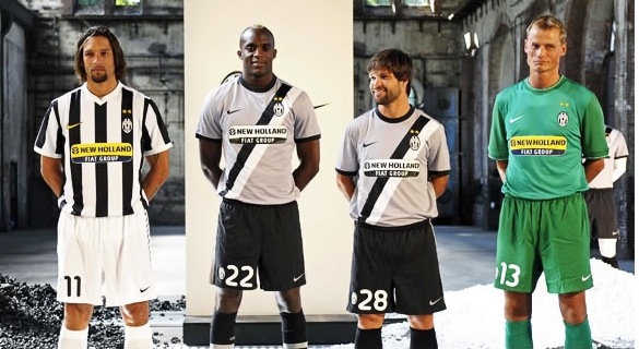
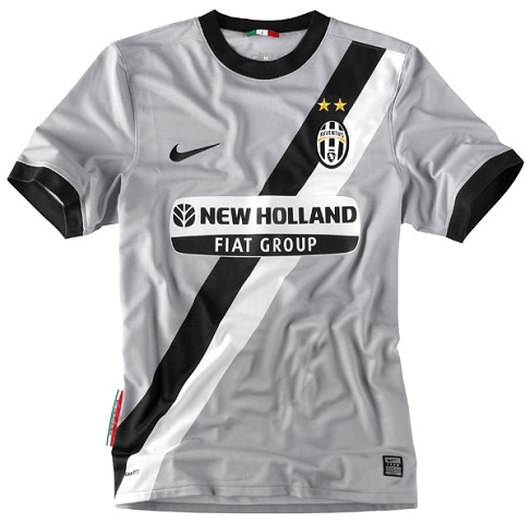
Juventus’s new home kit features black and white stripes, as usual. Juventus’s new away kit features, er, black and white stripes, albeit on a grey background.
I thought the whole point about an away kit is that it’s supposed to be distinctly different from the home version? I know that Juventus’s home kit has white shorts, with black shorts for the away uniform, but they’re still remarkably similar. So I can only assume that Juventus will get a fair amount of use next season from their other gold kit.
For what it’s worth, I like both new kits, even if they are too alike. The home kit is a classic and this version is one of the nicer versions in recent years, while the away kit is very smart and subtle. More pics – minus Momo Sissoko, new signing Diego and Alex Manninger – below:
J9001.jpg
J9002.jpg
You like?

Digg This
Reddit This
Stumble Now!
Buzz This
Vote on DZone
Share on Facebook
Bookmark this on Delicious
Kick It on DotNetKicks.com
Shout it
Share on LinkedIn
Bookmark this on Technorati
Post on Twitter
Google Buzz (aka. Google Reader)

By Ollie Irish on July 9th, 2009 in Kits & fashion, Serie A. You can follow any responses to this entry through the RSS 2.0 feed. You can leave a response, or trackback from your own site.
comments

5 Responses to “Juventus launch new home and away Nike kits for 09/10. Both have black and white stripes…”

  1. BijanBest says:

    The Away kit is fine, except that the black & white stripe makes them look like wearing a miss universe thingy on their shirt, and they also look like cheap t-shirt. And like you said, they are too similar. I still like the gold away jersey from last season.

  2. anna says:

    I like the kits, but, as BijanBeste already said, the stripes on the away jersey looks a lot like a sash. The people at Nike must really love the Miss look. Also see Dortmund’s away kit from last season:
    http://img225.imageshack.us/img225/5527/sooonz5bw4.jpg

  3. Raph88 says:

    2-3(?) tone green goalie kit is a bit shit.

  4. These are not correct.hey are too similar. I still like the gold away jersey from last season.

  5. They are too similar. I still like the gold away jersey from last season.

Leave a Reply