cool hit counter

Newcastle United’s new kit: spot the mistake

PA-7647616.jpg
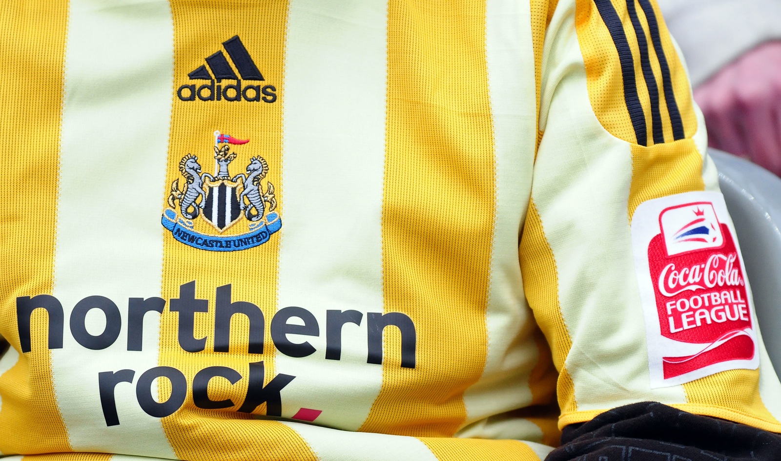
They got the badge wrong…
Aaah… what’s that?… Oh. Sorry. My mistake.
Seriously though, it still looks weird to see a non-Premier League badge on a Newcastle kit. I’m sure I’ll get used to it though.

Digg This
Reddit This
Stumble Now!
Buzz This
Vote on DZone
Share on Facebook
Bookmark this on Delicious
Kick It on DotNetKicks.com
Shout it
Share on LinkedIn
Bookmark this on Technorati
Post on Twitter
Google Buzz (aka. Google Reader)

By Ollie Irish on July 30th, 2009 in FAIL, Kits & fashion, Newcastle Utd. You can follow any responses to this entry through the RSS 2.0 feed. You can leave a response, or trackback from your own site.
comments

6 Responses to “Newcastle United’s new kit: spot the mistake”

  1. Delboy Dublin says:

    NewcastLOL

  2. Kipp says:

    the colour on my screen appears to be off, im certain it’s supposed to be black and white, and not piss and piss in snow

  3. Chringle says:

    Didn’t only 4 people turn up at the club shop when this monstrosity was released?
    Anyway I think the mistake is the inclusion of the word ‘United’ on the crest.

  4. Malone says:

    I’ve spotted another mistake. It says Northern Rock when it should say – Northern Cock.

  5. Dan says:

    Obsessed.

  6. ListenMan-WeJustAskForPrideAndPassion says:

    as above.
    just waiting for the ubiquitous ‘deluded fans’ routine..

Leave a Reply