£400k on the Olympic logo? Football does it so much better…
![]()
1 Argentina 78
Simple and effective.

2 Mexico 70
A classic logo from a classic tournament.
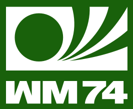
3 Germany 74
The WM stands for Welt Mannschaft, which is German for World Cup.
![]()
4 Italia 90
Nessun Dorma, Nessun Dorma etc.
![]()
5 Mexico 86
Looks like the logo for a cheap news TV station. Which is a good thing.