Manchester United’s New Half-And-Half 2016/17 Home Kit To Be Inspired By Newton Heath (Leaked Photo)

Chris Wright

19th, November 2015

6 Comments

1992-94-man-utd-newton-kit

Newton Heath have a lot to answer for

If the latest leaked image is anything to go by, it looks as though Adidas are going to be taking inspiration from Manchester United’s roots as far as next season’s home kit is concerned.

As picked up by the prolific and largely reliable kit design specialists over at Footy Headlines, Adidas are preparing to mark the second season of their massive supply deal with United by “fusing the half-and-half design of the very first Newton Heath kits with modern elements and fabric technologies.”

The results are supposedly going to be somewhere along these lines…

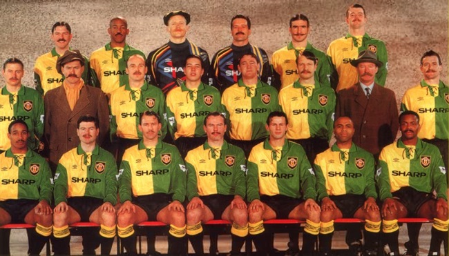
Whether or not Adidas have plans to bring back the ugly lace-up collar of the early Newton Heath kits (as replicated on Umbro’s 1992-94 effort) remains to be seen.

green-gold-newton-heath-1892-shirt

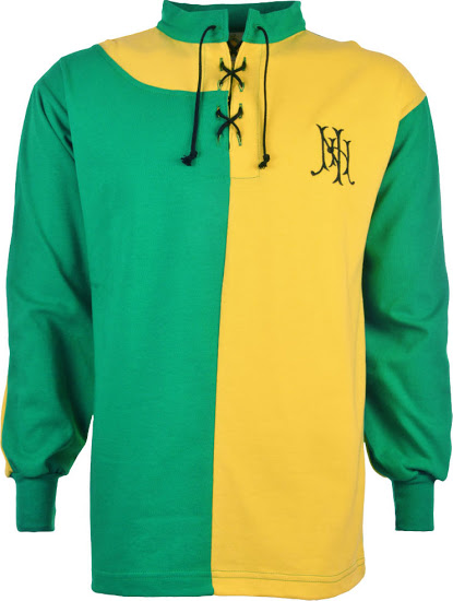
Reproduction of the original 1892 Newton Heath jersey

Let’s hope not, eh?

Posted in Kits & fashion, Man Utd, Newsnow, Photos

Share this article: Email

6 Comments

  1. Bruno says:

    It does not matter what they do, the Chevrolet logo will ruin it.
    United will wear shit kits for as long as they have Chevrolet as the sponsor.

  2. Chris says:

    100% agree. if it has to be Chevrolet they should just have the wording and a smaller logo in the same line.. lot more subtle.

    However Sharp should grow some balls and get their name back on Uniteds shirt.
    Liverpool take note; get Crown paints back on yours too.

  3. James Taylor says:

    Is Chevrolet really any worse than Vodafone, AIG or AON?

    • Jarren says:

      As stated above by the Other Chris, it’s not about the name itself.

      It’s the sheer size & damn CHINTZINESS of it. You may as well replace “Chevrolet” with “Trump Towers”.

      The Vodafone logo was practical, and AON logo was actually quite stylish. Admittedly the AIG logo was quite blocky and ugly, but it’s nowhere near as horrendous as the Chevrolet one.

      Again, it’s not about the name. It’s about the styling. If they just used the Chevrolet font without the bling above it, it would actually look really classy.

      I know someone’s gonna say “WHO GIVES A FUCK ABOUT THE KIT, IT’S FOOTBALL NOT THE CLOTHES SHOW” but some of us actually DO care.

  4. gfg says:

    We have had bad kits in the past. United knew about the Chevrolet logo ages before any contractual deals. But money finally spoke.As they say, ‘everybody has a price…no matter how high’. For me, Vodafone was the best kit for United…design, functionality, texture, colour and all

  5. Davvy Jones says:

    What the feck has Trump got do with United u mug Manchester is northern England shut ur mouth muppet north west u m1 pub monkey

Leave a Reply to gfg