By Matt Hill
As a now-loving Tottenham supporter dragged to his first game in 1986 – I seem to remember a very dull 1-0 win over Manchester City happening at the Lane in between me requesting sweets from my dad, with Graham Roberts the man to interrupt my annoying whines with cheers – Hummel kits emblazoned with Holsten were Year Zero. What was it with Spurs and Hamburg-based companies in the Eighties? Presumably with Irving Scholar the man in the chair, there were some great tax-break opportunities.
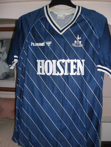
But in among the German love-in, someone had a road accident on our traditional white. All up in your face, the home shirt was loud and proud with its complicated and busy mosaic of multi-angled arrows and lines. Meanwhile, this third-choice strip sat at the back of the bus, steely stare piercing into the distance, quietly going about its business. It was the business…
It was an important shirt for the now-thirtysomething Spurs fan for two reasons: 1) Clive Allen wore it, and 2) he didn’t wear it very often. Couple a legendary performer (49 goals in one season, lest anyone forget) with rarity and you have an icon in the making, and this cool and commanding dark blue number certainly had the hearts of Junior Spurs a-flutter.
Remember, third kits were a bit of a novelty in the mid Eighties – it’s hard sometimes in an age when you’re lucky if your club isn’t miking you with a fourth, and Spurs seem to have a different sponsor dependent on what hour of the day they play. But, then, typical Tottenham – one of the first football clubs to become a PLC and a trailblazer in maximising kits sales. Yet with young eyes devoid of cynicism, in addition to the white home and sky-blue second strips, having this occasionally winking its steely polyester eyes at you was something to behold.
And I say occasionally because… well, we hardly ever wore it. I can’t find the figures, believe me I’ve tried (it would actually be great to know, so if you do, please tell us), but I only remember seeing it a couple of times. I can’t imagine our sky-blue kit clashed with many teams – even Coventry wore blue and white stripes back then. Yet it was because it was so rarely allowed out of the dressing room that it possessed the aura of a classic. A replica rebel, a merchandise maverick. Blink and you’d miss it – so you savoured its every second.
The full kit was actually all dark blue, but the shirt looked best when coupled with the white shorts and socks of the home strip, a killer contrast. I hoped that we’d follow suit this season – our 2010/11 home shirt is hands-down the best creation any kit manufacturer we’ve entertained has come up with in a decade. Unfortunately, the away strips are a shambles, each one an entirely different design, either dull or mismatched or both.
If only Puma had just reversed the home kit, with a dark blue shirt with white-striped shoulders and shorts, there would have been a consistency, a coherence and a ‘1986/87 third kit’ kind of cool about it. But then maybe they just can’t make them like this anymore. Although, even with all its history and certified rare collectible status, you can still pick it up online for £9 less than the current Champions League shirt will set you back. I know which one I’d rather be wearing.
Matt Hill is a writer and editor who writes and edits stuff, occasionally for money. See more of him at www.gethill.com, or follow his ramblings on Twitter: @gethill
More in the fav kits series (home kit unless otherwise stated):
