Image: @danielnyari/Twitter
Bayern Munich have officially unveiled a brand new club logo and yes, you’re looking at it.
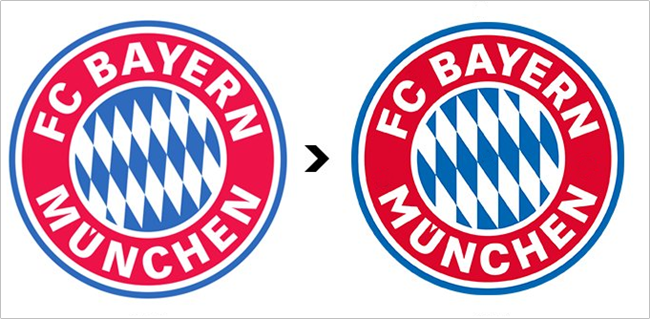
Up there (on the right) is the daring new sigil under which the Bavarian behemoths will play as of next season.
The obsolete crest is on the left.
From now on you will be seeing a new FC Bayern logo. The following changes were made to it. pic.twitter.com/CBezPUFNyz
— Daniel Nyari (@danielnyari) June 16, 2017
The subtle tweaks and updates are probably immediately evident, but we’ll let designer Daniel Nyari, designer and illustrator for Bayern US, explain them in detail…
- New and darker blue.
- New and warmer red.
- Vertex on ‘M’ is shorter and converges to a point
- Angle on Bavarian lozenges changes from -30 degrees to -35 degrees in rotation.
Lozenges were scaled up to fix uneven crop. Seven blue instead of eight blue lozenges across. - The terminals of the ‘C’ were lengthened.
To the untrained eye, it may look like they’ve just turned the contrast up a bit.
Definitely one for the design purists/obsessives, we think.