Barcelona have rejected a new kit design proposal from Nike because it’s far, far too white.
According to Mundo Deportivo, Nike submitted the shirt to Barca as a possible third shirt to be launched for the 2020-2021 season.
The design featured the cross of Sant Jordi on a predominantly blank field, but was quickly rejected out of hand by the Catalan club’s board for looking a bit too ‘Real Madrid’ for their liking.
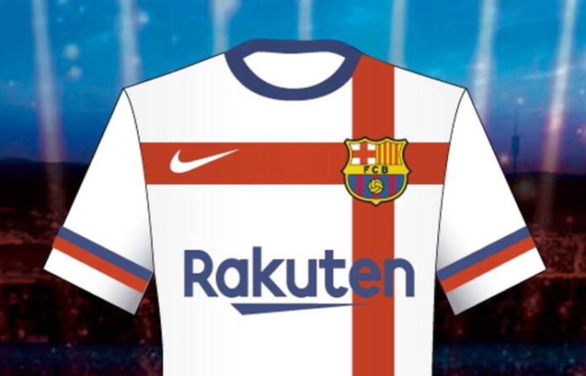
Image via Mundo Deportivo
Barca have played in white on their travels before, but not since the 1960s. The colour has since been unofficially “outlawed” by the club due to it’s more immediate association with their eternal Royalist rivals.
Indeed, so deep-seated is the hatred of all things Real that when Kappa introduced a white stripe along the sleeve of Barca’s 1992 home shirt, there was uproar among the more fervent section of the fandom. Since then, white has been avoided like the plague.
It shouldn’t be glossed over that Nike’s 2020/21 effort is also extremely hideous and could have quite legitimately rejected on those grounds too.