Photo: @LFC/Twitter
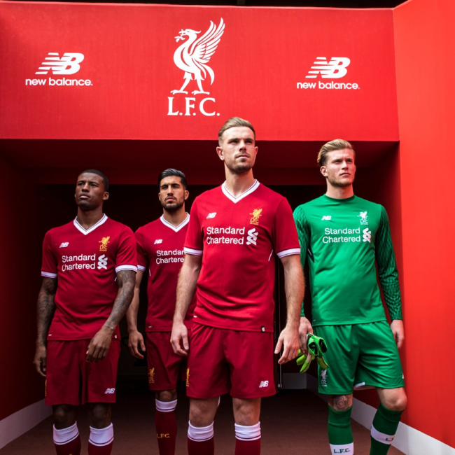
Liverpool have unveiled their new home kit for 2017/18 and, as always, the only variable is what colour the trim is this time.
Spoiler: it’s white.
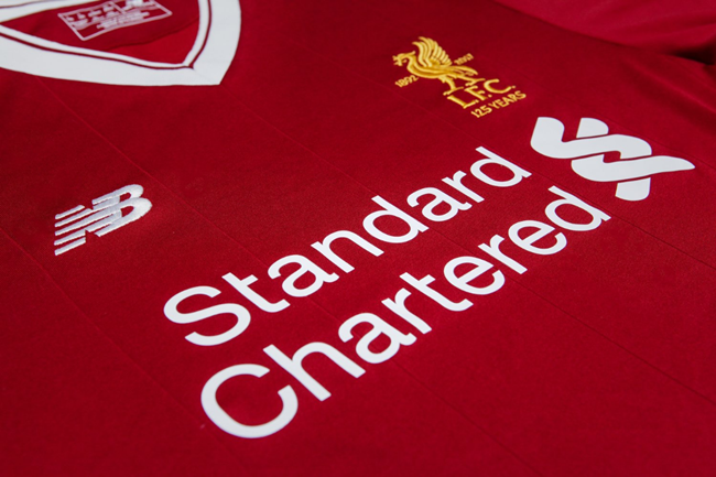
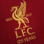
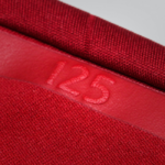
To mark the club’s 125th anniversary, there’s also a very slightly re-jigged badge on the chest…
The New Balance strip features the club’s commemorative crest for the first time, with the Liver bird emblem flanked by ‘1892’ and ‘2017’ embroidered onto the breast of the shirt – a unique element of the team’s kits for the next campaign.
In fairness, there’s a pleasing 1980s tinge to the strip, thanks to the oversized V-neck and the subtle ribbing on the shirt…
Four fans, all of them #PureLFC. A special gift for their constant and cherished support.
Pre-order yours: https://t.co/lcgZri2EPQ pic.twitter.com/8NapZpjXZf
— Liverpool FC (@LFC) April 27, 2017
Meh. It’s red, white and okay – a bit like an own-brand retro shirt.