Fighting Insidious Evil On All Fronts: Premier League Take Action To Ban Groundsmen From Creating Elaborate Pitch Designs

Chris Wright

3rd, August 2017

6 Comments

“Boo. Down with this sort of thing”

The Premier League have leapt into action to tackle the most insidious evil facing their product today: elaborate pitch designs.

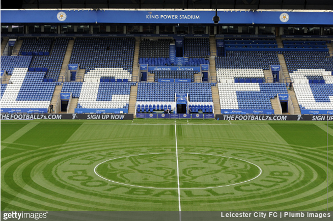
Thankfully, as of the publication of the League’s new influx of rules for 2017/18, the frightful displays of grassy decadence we were regularly confronted with last season – Leicester City being prime offenders – will be a thing of the past.

As announced on the Premier League website, all unusual “pitch patterns and designs will no longer be allowed”:

Rules state that the playing surface must contain no markings other than the traditional horizontal and white lines.

The change comes as the Premier League move their rules into line with UEFA’s Champions League regulations.

Indeed the UEFA UCL Club Manual decrees that all pitches should feature nothing but “straight lines, across the width of the pitch, perpendicular to the touchline” – and so it shall be.

And with that, the grand UEFA-driven sterilisation of any and all facets of football continues apace.

Posted in Premier League

Share this article: Email

6 Comments

  1. Olivier says:

    Are different shades of green really “markings” ? Because that’s all these pitch designs rely on… And even “regular” pitches have stripes of different shades of green, so I don’t see what part of the PL’s announcement makes sense…

    • jackie wilshere says:

      “The change comes as the Premier League move their rules into line with UEFA’s Champions League regulations.” <- here is the part of the PL announcement that makes sense. They're complying with UEFA. It's maybe UEFA's pitch design rules that don't make sense to you

  2. Geraldo says:

    Yet it’s OK for all grounds to have those obnoxious moving advertising hoardings which feature the names of soulless, immoral corporate sponsors who plough millions into the Premier League…

  3. Maria says:

    I agree in part with this. Designs like in the article above are distracting, they should stick to regular patterns. Not necessarily strictly perpendicular, though this does help with offside judgments.

    Advertising hoardings don’t bother me, guess I’ve learned to tune them out.

Leave a Reply to Maria