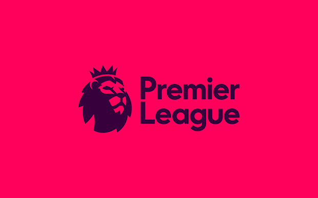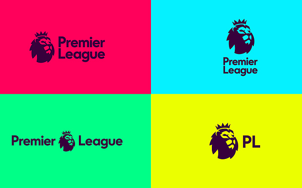
As you may or may not recall, back in January we brought you exciting news that the Premier League had hired a creative agency to unify their various arms under one slick branding theme.
Well, that day is finally upon us. The Premier League have proudly unveiled their new branding scheme and its… well, it’s very… colourful.
Despite reports that they were planning to cull the lion from their logo altogether, the handsome beast still sits front and centre.
They have, however, culled the title sponsor’s name (formerly Barclays) – a decision which “provided the opportunity to consider how we wanted to present ourselves as an organisation and competition,” waffles Premier League managing director Richard Masters.

The agency responsible for the re-design, Design Studio, emitted the following press release to explain their work:
Our aim was to create an identity that acknowledges everyone who plays a part in one of the most exciting leagues in the world
And with a fresh, new take on the iconic Lion, we’ve created an identity that’s purpose-built for the demands of the modern world. While staying true to the Premier League’s history and heritage.
Today’s release is just the start, there’s a lot more to come from the Premier League before the new season begins.
We can hardly wait.