“From the dawn of time, the protectors have watched over the land. Bull. Eagle. Dragon. Giant. They are symbols of the unfaltering solidarity and harmony of a nation that never recoils.” – from the press release to launch Iceland’s new football crest
I’ve read Game of Thrones, and that’s better writing than a lot of George R. R. Martin’s stuff, to be honest. The accompanying film is a belter too. Iceland’s history lends itself to fantasy, but can you imagine the FA trying to pull off something like this? Shudders in St. George.
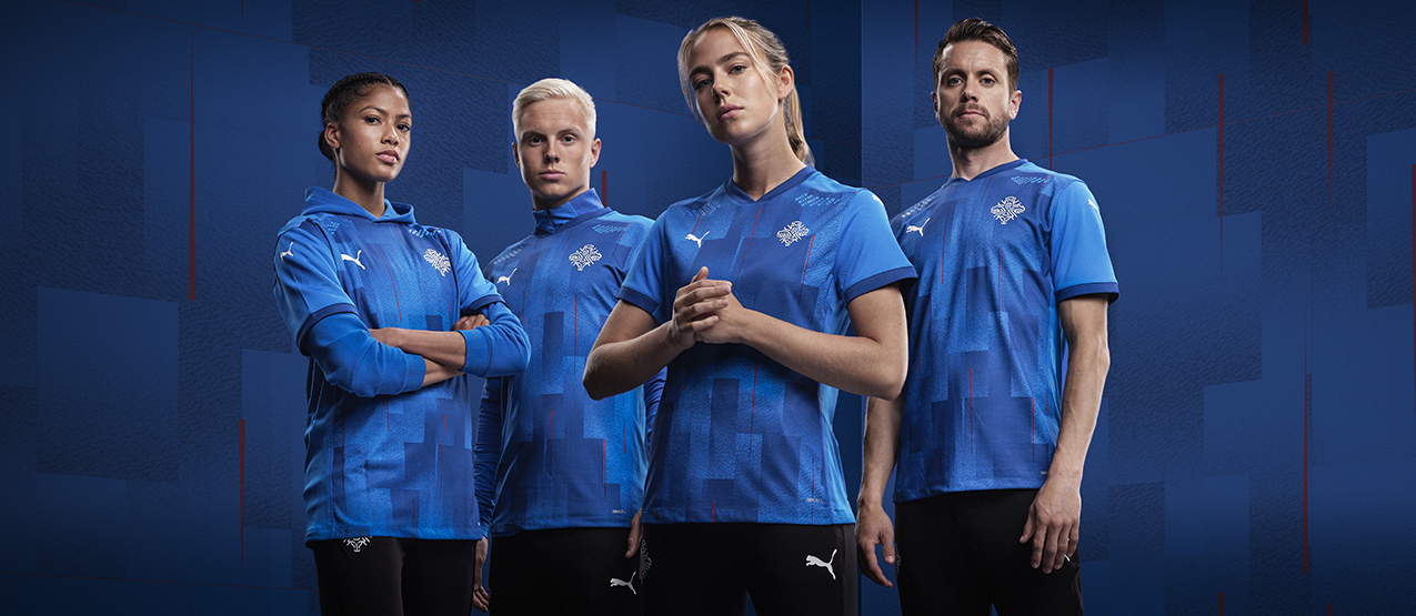
There’s a new Iceland Puma kit to go with the rebrand, and they’ve (sort of) nailed that too. I’m not sure about the gradient pattern on the shirt, but the crest looks great (click photo to enlarge):