On the subject of gaudy new kits, Girondins de Bordeaux have partially unveiled their third strip for next season.
We’d love to tell you that it’s a demure little number in that classic French style, but it’s actually a garish neon pink, purple and blue number that is made up of a collage of images of famous Bordeaux landmarks.
The town hall is in there, as well as the Grand Theatre and the “water mirror” outside the Place de la Bourse.
According to the club’s official blurb: “Three strong symbols are represented: pride, youth, identity.” D’accord.
See if you can spot any of those strong symbols in this leaked image, as procured by Todo Sobre Camisetas…
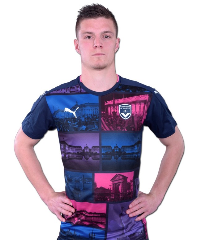
Photo via Todo Sobre Camisetas
We like it, if only because it sort of reminds us of those ‘Fat Willy’s Surf Shack’ t-shirts everybody used to have.