Marseille’s 2011/12 European Kit Is A Little On The ‘May Cause Temporary Loss Of Vision’ Side
By Chris Wright
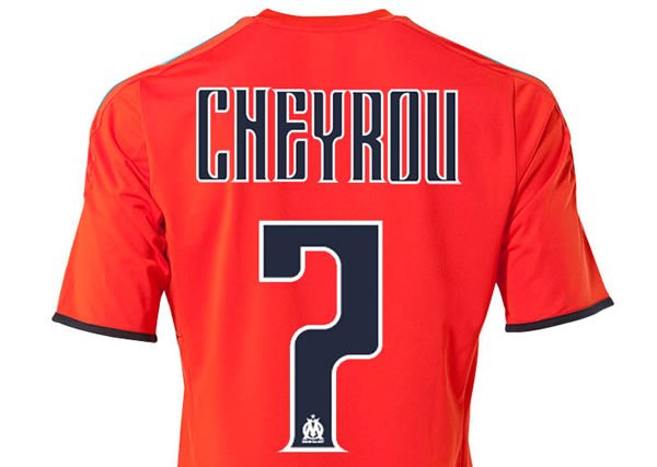
Presenting: Olympique de Marseille’s brash new European kit for 2011/12 – ‘the future’s bright’ and all that jazz…
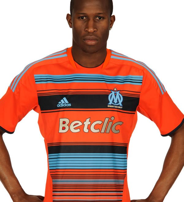
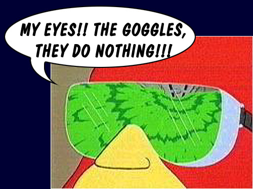
Apparently, L’OM’s new retina-searing togs are orange (to the Nth degree) as a nod back to the inside of the bomber jackets that their fans used to display in the ’80s as a sign of their collective ‘rejection of intolerance’ – which is a worthy sentiment, even if my eyes are still refusing to un-cross themselves.
Yay or nay?


Do Arsenal Artificially Enhance The Emirates Atmosphere? – OTP
Big Cup Bullshit – The FCF
Guess UEFA Cup Finalists From Their Shirt – Three Match Ban
20 Damning Steve Kean Quotes – Mirror Football
'Abandon All Hope…' – Sunshine Room
Leaked Blackburn Letter Shows Extent Of Turmoil – EPL Talk
Genius Who Couldn't Exist Today: Dragan Stojkovic – LBITCR
German Philosopher Reflects On Jose Mourinho – Futfanatico
Rule Changes That Could Hand Title To Man Utd – FourFourTwo
Welcome To Posh – Danny Last for IBWM
He looks like a Gillette razor…
I can live with the orange one, but the blue one on the third foto is horrendous.
Nay.
Pouri complet ce maille water
[...] DO THESE COME WITH A SEIZURE WARNING? Marseille’s 2011/12 “European kit” (which I didn’t know was a thing) is mesmerizing, in the bad way. // WAATP [...]
The orange with the lettering is awful lol
3rd kit reminds me of saint pauli’s special reversable kit.
http://2.bp.blogspot.com/_Aub-pDo8ESw/TDdJn0fh99I/AAAAAAAABC8/7S8ix9IgsAU/s1600/Saint-Pauli-Home-Reversed-special-side.jpg
This is the worst kit I’ve laid eyes on since 1994.
Looks like Gignac has been letting himself go this summer, bit of a spare tyre
Every year we got an European Kit ugly, but this year…
Terrible.