Shit Lookalikes: New Premier League Arm Patches & Tesco Value Baked Beans

Chris Wright

9th, February 2016

4 Comments

As previously mentioned, the Premier League have unveiled their daring new branding for the 2016/17 season today, which can only mean one thing: BRAND NEW ARM PATCHES!

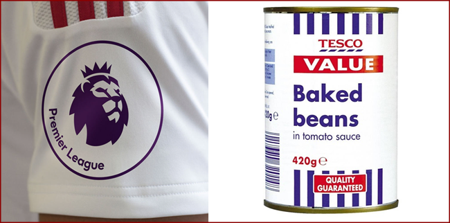
However, the results are what you might call ‘disappointing’, with the new kit marques looking incredibly cheap and tacky.

In fact, we’re sure we’ve seen them before somewhere…

premier-league-patches2

Naff as owt.

Posted in Lookalikes

Share this article: Email

4 Comments

  1. Mr Sensible says:

    The whole branding identity is pretty weak and lazy. What I found the most lazy was that DesignStudio (who did the work) used the exact same typeface as they used for their rebranding of AirBnB.

    How the hell did they come to the conclusion that a brand that wants to be viewed as the highest level of domestic club football and is known for its fast paced aggressive style should use the same typeface as a brand that advertise nice rustic apartments to take your GF on a weekend holiday would.

Leave a Reply