Man Utd Unveil New Nike 2014/15 White Away Kit – Little Bit On The ‘Meh’ Side (Photos)

Chris Wright

23rd, July 2014

8 Comments

By Chris Wright

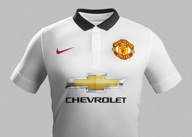
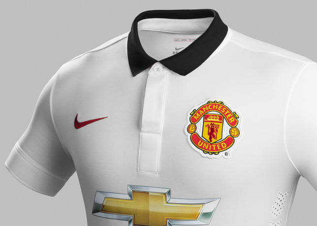
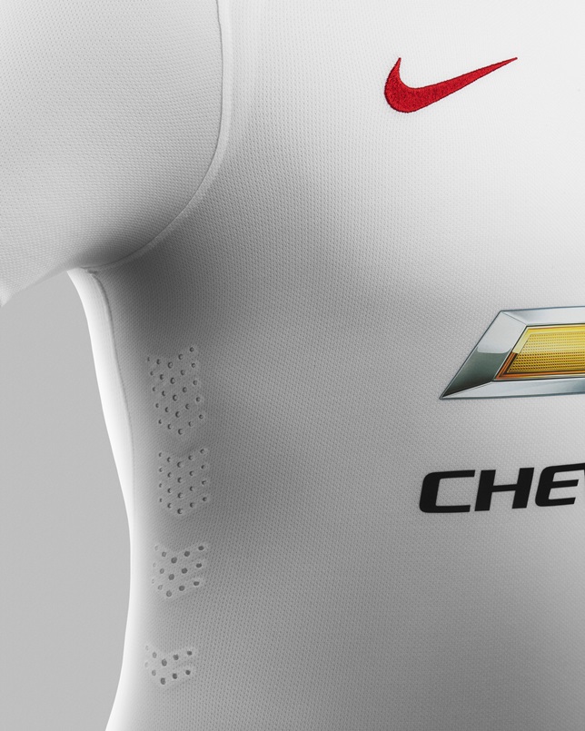
As you’d expect, Manchester United have rolled out a sparkling new white away kit to go with their new red home togs.

It’s a clean, simple affair once again besmirched by that horrible chintzy Chevrolet logo…

Fa14_Match_Manchester_United_PR_A_Front_R_31647

Su14_Match_Manchester_United_PR_A_Crest_R_31646

Su14_Match_Manchester_United_PR_A_Venting_R_original

Su14_Match_Manchester_United_PR_A_Full_Body_R_original

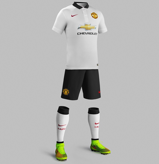
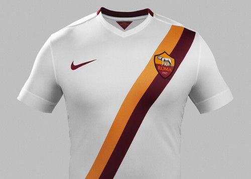
Bit dull, isn’t it? Not a patch on, say, the eternally handsome brute Roma will be wearing on their travels next season…

Fa14_Match_AS_Roma_PR_A_Front_large

*Swoon*

Posted in Kits & fashion, Man Utd, Photos

Share this article: Email

8 Comments

  1. Cosa says:

    What you don’t realise is that it’s revolutionary and you should buy it

  2. SG says:

    Roma’s shirt reminds me of Peru’s 1978 World Cup shirt. Except for different colours, obviously.

  3. Bruno says:

    The problem is that Chevy logo. If you took that shit out it is a really nice shirt.
    Man Utd will wear ugly shirts for the next 6 years due to Chevrolet. No matter how cool is the shirt, the sponsor will ruin it.

  4. dc says:

    Amazing what a lack of a sponsor logo will do to the classiness of a shirt, eh?

  5. Jarren says:

    The main problem is actually sheer fuck-off-here-I-am-ness of the logo.

    It’d have been a much better idea to just use a smaller black outline, or better still just use the font and forget the logo altogether.

  6. Bruno says:

    They are paying a lot of money to Utd. They want their logo as big as possible.

  7. Anonymous says:

    The ugly one

Leave a Reply