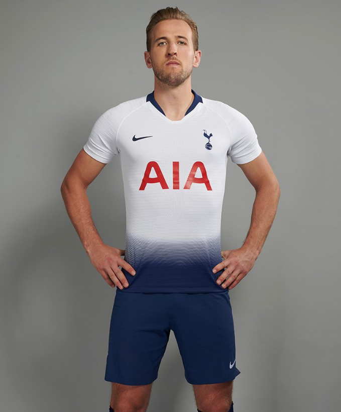
Tottenham have launched their new home and away kits for the 2018/19 season – the first batch of strips that will be worn at their new White Hart Lane stadium, as and when it opens for business.
Like several others we’ve seen of late, Spurs and Nike have opted for the ‘gradient’ approach, most notably on the home shirt.
As you might expect, the jersey in question is predominantly white, though the lower quarter is designed to look like the inky blue shorts are leeching up into it.

Personally, Pies think the shirt looks a bit naff in and of itself, especially without the requisite shorts to complete the full facade.
Dare we say, we’d even go as far as to suggest it’s bordering very precariously on possibly perhaps maybe being… ugly?
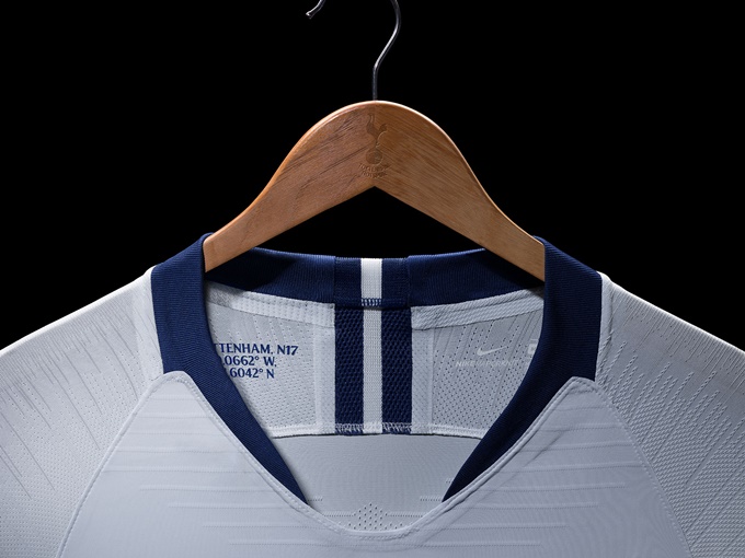
However, there is a nice little nod to the past featured on the inside of the collar, with the display of Spurs’ London postcode (N17) and the exact grid coordinates of the centre-circle at the old Lane.

Thankfully, the away strip is a little more conventionally easy on the eye, with the ‘knitted’ gradient effect confined to the sleeves – as we’ve seen in so many of Nike’s template designs for the World Cup and the inbound season.
The ‘electric’ shorts look pretty cool though…

Yep, that’s an overall ‘meh’ from us. Something tells us neither of these are going to go down as modern classics.
Any thoughts folks?