After being thoroughly impressed by their unforgivably half-arsed cut+paste job on Tottenham’s new away kit, Pies feel we must give Nike their dues for following up with a genuine corker of a third shirt for the 2018/19 season.
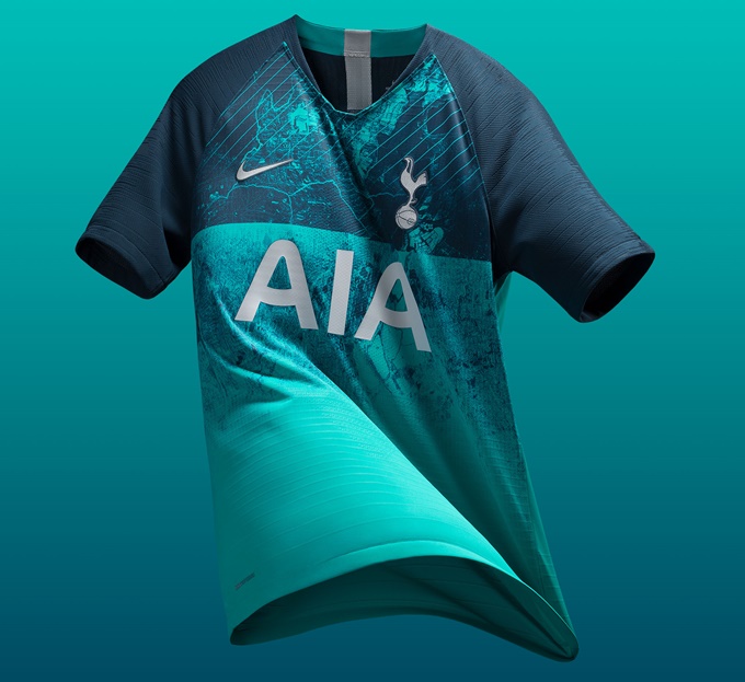
While it may look like a splotchy mess on first view, Spurs’ new third shirt (which, we note, is the exact same colour as the aforementioned away shirt) is an altogether more inspired, creative design that incorporates aerial and historical photography into the equation.
Indeed, look closer at the turquoise and navy shirt and you will see that the asymmetrical doodle is actually a contrast image of the club’s North London location in the Borough of Haringey (N17)…


According to the Nike PR blurb, the green-ish hue used for the kit is a nod to the original logo of the brewery that owned a portion of the land where the Spurs’ new White Hart Lane stadium is being built.
The strip will be worn in European competition this season meaning, in our humble opinion, that Spurs will look damn savvy as they go traversin’ the continent.