
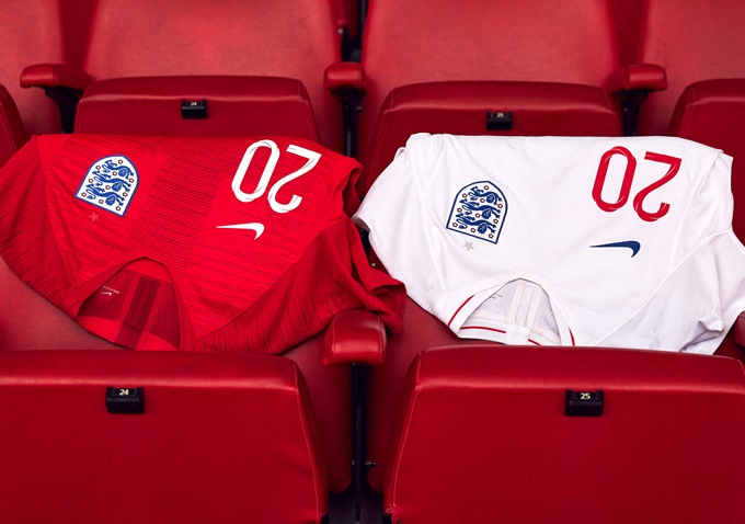
What you’re looking at there is the new Nike kit that England will be wearing when they go bravely slunking out of the World Cup at the last-16 stage this summer.
As was leaked earlier in the week, the home strip sees a return to the traditional white shirt/navy shorts/white socks arrangement, though there is little of note beyond that.
Granted, it’s perfectly smart (and a considerable improvement on the strange pale bluey-grey trim of the 2016/17 strip) if a little simplistic…


The away kit is once again rendered in traditional red, with subtle two-tone stripes that Nike claim “evoke speed” and “reflect the youthful wave of talent” presently flooding the England set-up.

They also claim that while the lettering and numbering is rendered in a custom font, they are informed by Johnston and Gil Sans – two “quintessentially English” fonts that are used on both overground railways and the London Underground.
The official training shirt, complete with a flashy graphic, is altogether more adventurous and would have made a decent home shirt if Nike had the minerals to try something a little different…

So, nothing particularly ground-breaking or memorable but a batch of inoffensively trim kits to unleash on the world stage 124 days from now.
We can safely say the new England kits have failed the patented Pies benchmark test: Nobody is going to be fondly remembering these things in 20 years’ time.