Shit Football Kits: Puma’s Africa Unity Strip, 2010
By Chris Wright
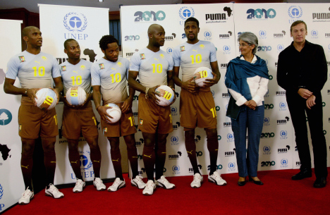
“The brown tone was created by mixing actual soil samples from Ghana, Ivory Coast, South Africa and Cameroon. The colour gradient transitions from brown to blue is a visual metaphor for soil to sky, with the yellow badges, names and numbers all representing the sun shining down on Africa.”
As read the official blurb when Puma released their new ‘Africa Unity’ kit unto the world in time for the World Cup in South Africa last summer, with all four of the African qualifiers having this well-meaning monstrosity officially recognised as their respective third-choice kits by FIFA.
You don’t need me to tell you that, rather than evoking memories of Africa’s flora and fauna, it just looks like it’s an off-grey strip that has been dipped in a vat of watered-down elephant dung somewhere along the line…
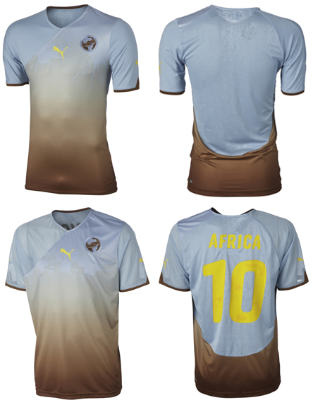
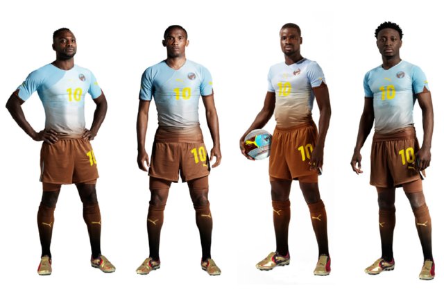
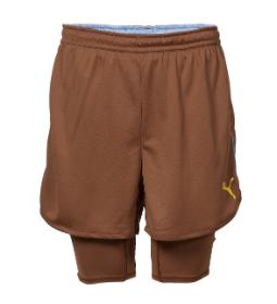
Don’t get me wrong, Puma’s ethos for the Africa Unity strip was admirable – but their execution was, quite literally, shit. I mean, it’s got a tide mark for Christ’s sake!
More in our Shit Kits collection…
Wolves’ Goodyear Tyre-Marks, 1992
Colorado Caribous’ Rodeo Fringe, 1978
Huddersfield’s Electric Tie-Dye, 1991/92
Nottm Forest keeper kits of the mid-1990s
Sheffield United’s diamond kit
Partizan Belgrade, early 1990s


Do Arsenal Artificially Enhance The Emirates Atmosphere? – OTP
Big Cup Bullshit – The FCF
Guess UEFA Cup Finalists From Their Shirt – Three Match Ban
20 Damning Steve Kean Quotes – Mirror Football
'Abandon All Hope…' – Sunshine Room
Leaked Blackburn Letter Shows Extent Of Turmoil – EPL Talk
Genius Who Couldn't Exist Today: Dragan Stojkovic – LBITCR
German Philosopher Reflects On Jose Mourinho – Futfanatico
Rule Changes That Could Hand Title To Man Utd – FourFourTwo
Welcome To Posh – Danny Last for IBWM
I think that’s a bit harsh, it’s alright.
i like it. That soil through to the sky thing is good
i couldnever put down an idea as creative and well-intentioned as this. i love it just for what it stands for and what the colours represent. it’s intelligent.
its ok..
It doesn’t look that bad, honestly.. Your criticism here is a tad too much, I have to say.
ye u prick. it’s not that bad u sap. would love to see u design somethin better u plonker.
I can’t believe what I’m reading. It’s atrocious!
I hope “dirt” color catches on, then I will never have to wash my clothes.
Normally I’m with you Chris but on this one I think you’re wrong, I rather like it. But then I’m rather partial to the Stade Francais flower rugby jersey, and everyone berates me for that.
It’s by far the nicest kit ever to make the “shit kits”. It’s a good idea, somewhat imperfectly carried out, but I see worse kits in the PL and Championship every weekend.
Unfair critique of a good (but flawed) idea. I agree with:)
I’m with everyone else, its actually quite a nice kit. I even tried to buy one.
Well, there’s no accounting for taste I suppose!
I seriously cannot believe there have been so many comments in favour of this kit!
I’m with Chris on this one – the thinking’s good but the whole thing stinks. It looks like it’s been left in a sewage overflow for a fortnight.
Well, i think the design is quite inventive and worn over dark skin it looks great. I guess it will look a bit shitty on european players.
While it’s a very well thought out design, it’s still an ugly kit. but not as ugly as nearly all of the other shite kits you’ve posted. I’d go as far as to say it’s the nicest of all the shite kits
The metaphor is delightful and hopeful, but the kit is awful.
Good idea for the kit, but it makes the players look like they just ran through a mud pit, or were dipped in a vat of brown stuff and sort of hosed off