Nike Officially Launch New Barcelona Kits (Photos & Video)
By Chris Wright
Coming roughly a day or so after leaked pictures of Barcelona’s suspected new home strip began doing the rounds, Nike have officially launched the flash new kit that the Catalans will be wearing as of next season with a nifty little teaser video and a batch of top-notch photos…
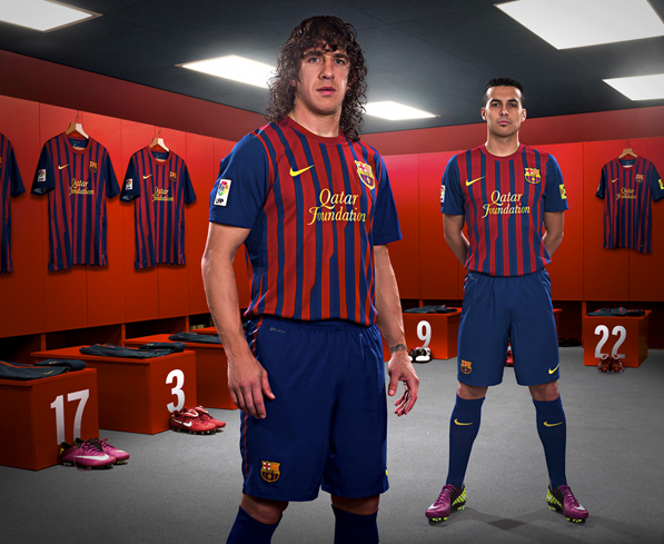
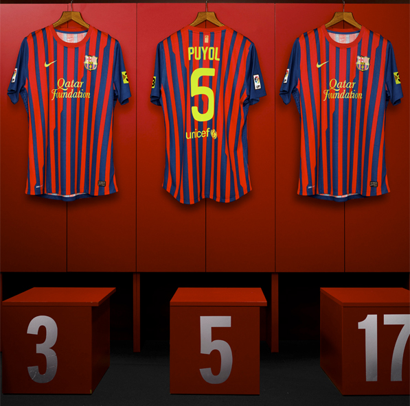
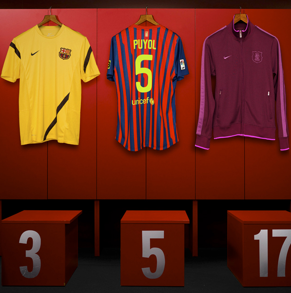
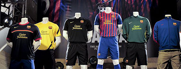
How do you like them apples?
Photos via Original Winger.


Do Arsenal Artificially Enhance The Emirates Atmosphere? – OTP
Big Cup Bullshit – The FCF
Guess UEFA Cup Finalists From Their Shirt – Three Match Ban
20 Damning Steve Kean Quotes – Mirror Football
'Abandon All Hope…' – Sunshine Room
Leaked Blackburn Letter Shows Extent Of Turmoil – EPL Talk
Genius Who Couldn't Exist Today: Dragan Stojkovic – LBITCR
German Philosopher Reflects On Jose Mourinho – Futfanatico
Rule Changes That Could Hand Title To Man Utd – FourFourTwo
Welcome To Posh – Danny Last for IBWM
Luckily for Barca, that 126-odd million will make up for a substantial reduction in shirt sales….
I’m not convinced by the thin stripes yet.
Besides that, I think it’s ridiculous there has to be a new kit every bleedin’ year nowadays for nearly all teams.
Yuck! I’ll be sticking with this year’s, thanks :/ It’s too stripey…
Nope. Nike got it all wrong with the thin stripes on their new kits. The Milan kit has them and doesn’t look particularly good either. I’m within the poster above, gonna stick with this year’s, much nicer.
And the last of the great shirts go……That sponsor ruins everything.
On the plus side, the away kit is lovely.
http://www.fcbarcelona.com/web/Galeries/club/temporada10-11/05/nova_equipacio/puyol_away.jpg
fucking shite!
Thats a terrible strip. The stripes are shocking. Also sad to see advertising on it. Will help with their massive debts i guess ;-)
Absolute shite…
Didnt i heard some clowns saying these are fakes. Makes me laugh at them
Hmmm plain away kit, that’s not too bad. I just hate the new sponsor’s logo…
It’s hideous – Carles Puyol is more attractive to look at than that shirt. I quite like the classic maroon jacket though.
Why have the pictures been taken on the deal or no deal set?
haha at deal or no deal set
i think the whole set of shirts look fantastic, nothing wrong with a little change lads, open your minds
The away kit looks pretty sweet without sponsors
MY EYEEEEEEEEEEEEEES
@Jonathan: Excellent call Sir!
I’m hoping that the guys that sell the knockoff kits will make some without the s#&$ sponsor. Might buy one then…. Maybe. Hell, no I won’t F@$& you Qatar Foundation!
Awful. The worst set of kits I’ve seen in my lifetime, and likely ever. Commando khaki away kits and colors that don’t technically register in the visual spectrum are vastly better than all black aways. And, the whole guys wearing girly colors has gone far enough. those magenta and hot pink tracks are just disgusting. Damn it.
@wolfusa, of course you’re after “commando khaki” away kits… WOOOOO! YEHHHH!!!! ALRIGHT!!
the sponsor logo looks like i made it on MS word
Complete opposite to how things usually go – the concept images looked quite interesting, but the actual shirt looks utterly shite on the players.
this article should be in the “shit kits” section of pies
The UNICEF logo was great and manifested the Barca ethos of ‘more than a club’ but these new kits are proper RUBBISH
SHIT
ohhhhhhhhhhhhhhhh dear lord
dodos catalanos visca barca
Shite as usual. I’ll be sticking with plain white, thanks.
I am not buying this. Maybe the away kit, it’s cool. But I think Nike messed up our shirts, real bad.
sponsor KILLS it. but good on them for supporting charity’s.
this is utter rubbish,nike messed up our shirts and the sponsor’s loggo is simply awful.i’m not buying this never i will stick to the old one
the UNICEF logo was classic……new sponsor has killed the shirt….never buying tht