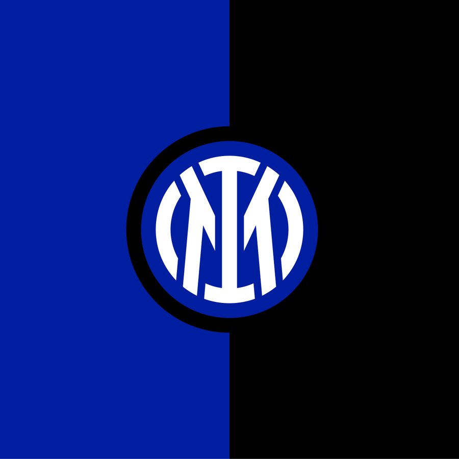
This is Inter’s brand new club crest:
And, a reminder, here is Inter’s previous badge:

Call me old-fashioned, but I prefer the old one. That’s an understatement. Try this: the new one is crap. It’s nowhere near Spanish FA-levels of crap, but it’s definitely crap. It may grow on me, but it looks too template-y and too much like a baseball team’s badge.
Inter love a bit of crest-tinkering, mind. They’ve had more than a dozen different badges since their creation in March 1908:
The evolution of the Inter Milan's logo 🔵⚫️
[@90ordnasselA] #Inter pic.twitter.com/QWolp6Y9QN
— RouteOneFootball (@Route1futbol) March 30, 2021
If you noticed that Inter’s crest from 1928-29 looks a lot like car manufacturer Alfa Romeo’s logo, you’d be right (and well done for spotting it, you’re very bright). Both feature the Biscione grass snake, a symbol of the city of Milan’s House of Visconti. The red-and-white cross (steady, Nigel) is also synonymous with Milan, dating back to the Crusades – Inter once sported a kit that featured the cross, and what a smart kit it was.
Anyway, back to the new badge. It’s a no from me. Of all the badges Inter have had, the first one was probably the best. Porca miseria!
I do, however, really like the look of Inter’s possible new fourth kit (fourth kit, I know), leaked earlier this week:
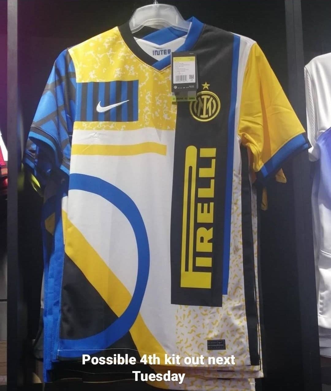
Yeah, that’s a W.