Leeds United’s New 2018/19 Away Shirt Has Intriguing ’90s Bed Sheet’ Aesthetic (Photo)

Chris Wright

9th, August 2018

6 Comments

Leeds United have deployed their new away shirt for the 2018/19 season and, Jumpin’ Jehovah, it’s a bit of a stonker.

In fact, Pies could swear blind we had this exact same bed sheet/curtain combination circa 1995-ish…
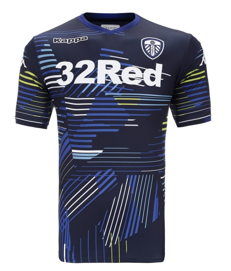
Photo: @LUFC/Twitter

Rad to the max. Gnarly and dope and all that kind of thing.

It looks suspiciously similar to every bus seat you’ve ever sat on – which is a definite positive as far as we’re concerned.

Posted in Championship, Kits & fashion

Share this article: Email

6 Comments

  1. MAD FAN says:

    Why make the club crest in white? I fucking hate this trend. A club crest has colours, history and these fuckers should respect that. We already have to put up with horrible shirts with horrible templates with horrible angry birds and horrible chevrolet logos all over it, why the fuck can’t they make the club crest right???

    FUCK

    FUCK!

  2. Franny says:

    Is this a nod to the John Lukic GK lot of c 1994?

  3. VieuxSang says:

    Very nice, but MAD FAN is right. Yorkshire white or no, let’s have the rest of the colors. Always the damn Italians experimenting with something that should be left alone, witness Juve’s crest.

Leave a Reply