It goes without saying that pretty much every football kit in the modern era looks better without a sponsor’s logo, but some clubs really get shafted in that department…

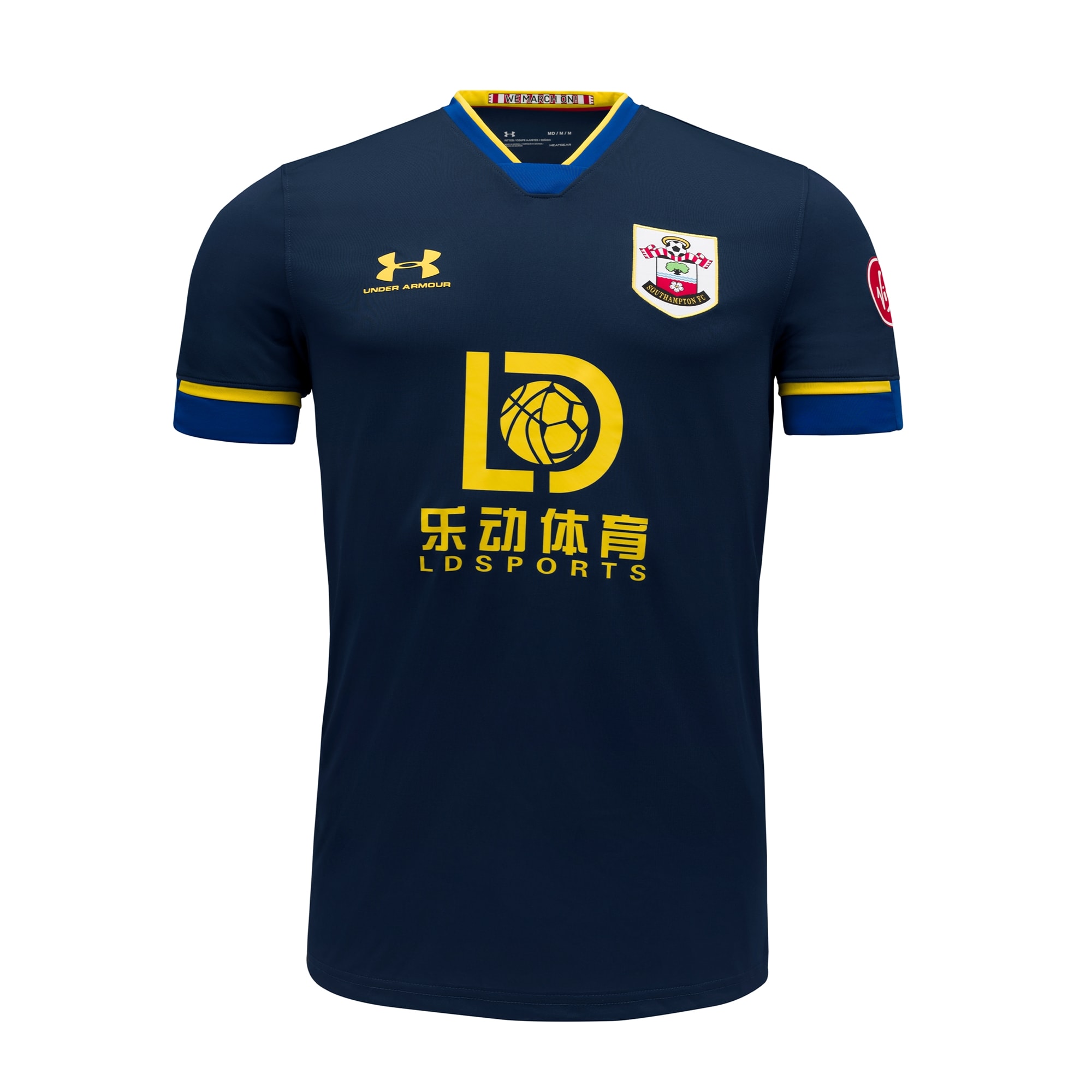
Southampton away – An Under Armour shirt messed about by a hideously cheap-looking LD Sports logo. Even the club logo looks out of place. Shame, as the blue-and-yellow colour scheme is classy.
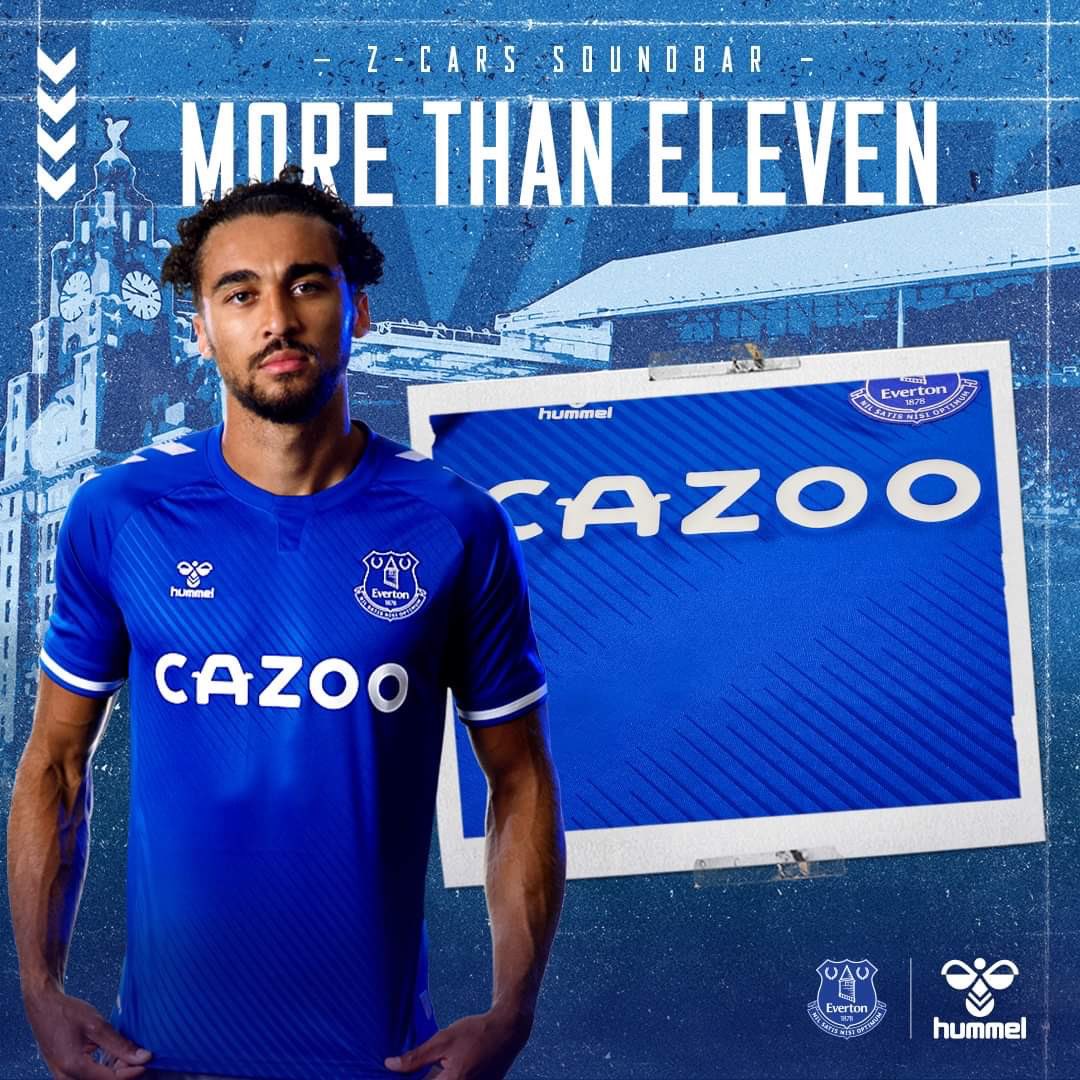
Everton home – Hummel can do little wrong in Pies’ eyes, and their new Everton home shirt is no exception. Imagine how much better it would look without the logo of a used car company on the chest.

Newcastle Utd home – FUN88!!! Textbook lesson in how to make a simple, classic kit look cheap as chips.
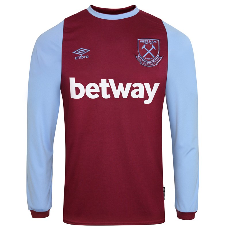
West Ham home – The Irons’ 125-year anniversary kit is a gorgeous retro effort, save the big betting company logo.
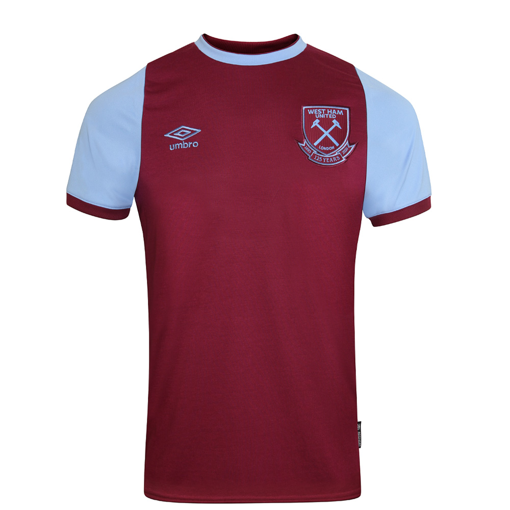
That’s better. So much better.
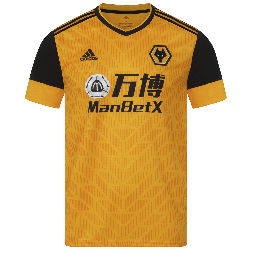
Wolves home – Adidas has pulled off the rare feat of designing a shirt that looks interesting and contemporary. The absolute state of that sponsor logo, though. Yikes.